About
The Project
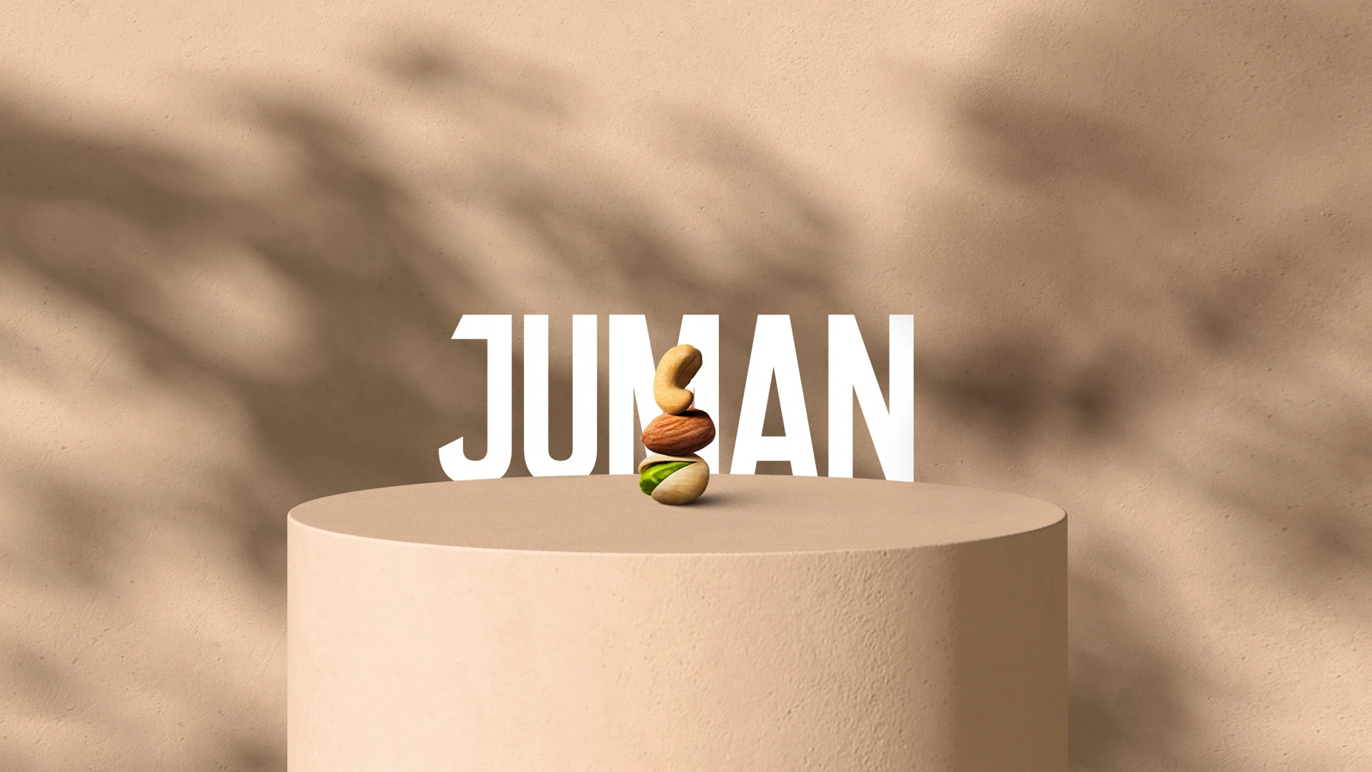
Juman was created as a premium brand that sells traditional nuts with an edge. The brand was created to enter the market and establish itself as a no-frills, high-quality snacking companion and go-to healthy snack of choice.
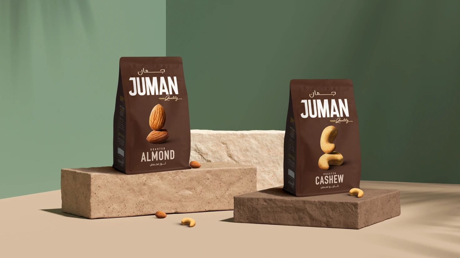
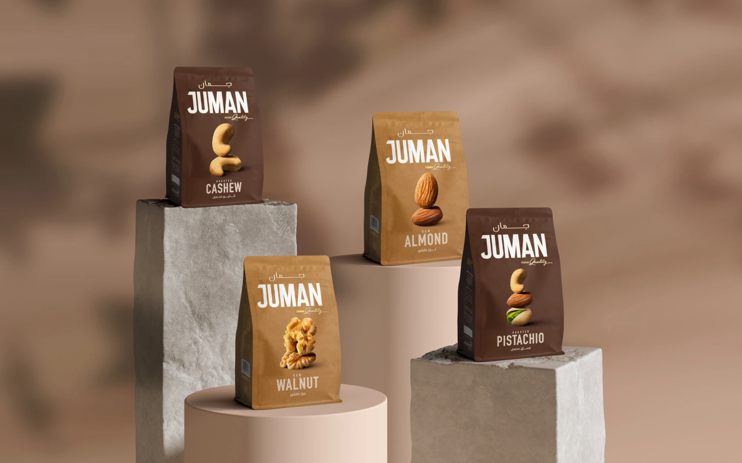
To complement its refined, honest and convenient nature, we created a simple yet sophisticated packaging design that would be sure to highlight the brand’s premium yet approachable essence. We make use of both modern and classic typefaces, both of which serve a specific purpose. Our modern and bold typeface gives the brand a distinct edge in the market, while the classic typeface gives Juman a sophisticated touch that instantly elevates the brand as a whole.
We tie the brand’s identity together by creating a very minimal visual language in which we simply highlight the nut on the packaging, set against a plain backdrop that is made up of our color palette. Our color palette itself consists of various shades of beige and brown, reflective of the purity and quality of the nuts themselves.

The Design Concept
Lorem ipsum dolor sit amet, consectetur adipiscing elit, sed do eiusmod tempor incididunt ut labore et dolore magna aliqua. Ut enim ad minim veniam, quis nostrud exercitation ullamco laboris nisi ut aliquip ex ea commodo consequat. Duis aute irure dolor in reprehenderit in voluptate velit esse cillum dolore eu fugiat nulla pariatur. Excepteur sint occaecat cupidatat non proident, sunt in culpa qui officia deserunt mollit anim id est laborum.

The Colour Palette
Lorem ipsum dolor sit amet, consectetur adipiscing elit, sed do eiusmod tempor incididunt ut labore et dolore magna aliqua. Ut enim ad minim veniam, quis nostrud exercitation ullamco laboris nisi ut aliquip ex ea commodo consequat. Duis aute irure dolor in reprehenderit in voluptate velit esse cillum dolore eu fugiat nulla pariatur. Excepteur sint occaecat cupidatat non proident, sunt in culpa qui officia deserunt mollit anim id est laborum.

Next Project